 |
|
 09-19-2011, 06:46 AM
|
#1 |
|
Think Blue!


|
I have been thinking about starting to do cigar artwork.
I have created this thread to discuss my art, get opinions and display what I have created. I did my first cigar art pencil sketch this weekend, what do you guys think? It is about 9"-10" long. It looks much better than the pic gives it justice. 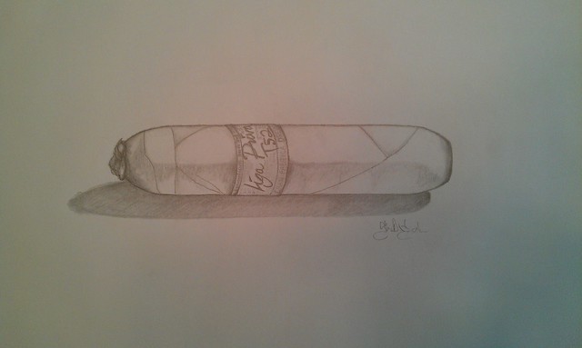
__________________
SUPPORT OUR TROOPS |

|

|
|
09-19-2011, 07:22 AM
|
#3 |
|
Country Gentleman

|
I mean no disrespect personally, but I don't see this as art. It's a simple drawing or sketch. It doesn't convey anything to me other than it's a cigar.
__________________
'It is an honor for a man to keep aloof from strife; But every fool will be quarrelling.' |
|
|
|
|
09-19-2011, 07:33 AM
|
#4 | |
|
Think Blue!
|
Quote:
Personally I see a simple drawing or sketch as art, if it speaks to you personally or not. Thanks for the opinion though, I respect your honesty.
__________________
SUPPORT OUR TROOPS Last edited by Blak Smyth; 09-19-2011 at 07:43 AM. |
|
|
|
|
|
09-19-2011, 08:55 AM
|
#7 | |
|
Think Blue!
|
Quote:
__________________
SUPPORT OUR TROOPS |
|
|
|
|
|
09-19-2011, 09:29 AM
|
#8 | |
|
Country Gentleman
|
Quote:
__________________
'It is an honor for a man to keep aloof from strife; But every fool will be quarrelling.' |
|
|
|
|
|
09-19-2011, 09:41 AM
|
#9 | |
|
EMPEROR TOMPKINS


|
Quote:
 That's why I don't really get art, I don't always see what I should and I don't know how to preceive it sometimes that it just frustrates me, but I see your point. That's why I don't really get art, I don't always see what I should and I don't know how to preceive it sometimes that it just frustrates me, but I see your point.
__________________

|
|
|
|
|
|
09-19-2011, 10:26 AM
|
#10 |
|
Serial banter killer

|
Looks fine to me, Shane. Growing up surrounded by artistic siblings and other family with not a lick of skill in me, I appreciate your work for what it is. With that said, I think once you get past the sketching phase and into bringing something original from within you to the pad or canvas, that's when you'll really get some accolades.

__________________
I loves me a Parti 
|
|
|
|
|
09-19-2011, 01:31 PM
|
#11 |
|
Just in from the Storm

|
We are not the first group to ever ask "What is art?". Probably few topics have been more debated excepting "What is the best caliber - 9mm or 45ACP?". While some like wayner123 may not view the simple pencil sketch as "art", the sketch strikes an emotional chord in Mickey and he sees art. Opinions differ, that gives flavor to life.
Whether or not we will agree if it is art, I suspect most,if not all of us will agree that you are an "artist". I say this because of the work you have done on your avatars and their reception in this forum. That work really stands on it's own. Whatever anyone thinks of your sketch (and I like it very much), I believe that it is only a seed that has been planted and that you certainly have the talent to grow that seed and if it is not "art", it will most certainly lead to "art". Please do not think I am being flippant or sarcastic, because I'm not. You have the beginnings of a dream and some talent. Pursue that dream. If the art is in you, it will surface.
__________________
 Randall - U.S.M.C. - Vietnam Veteran |
|
|
|
|
09-19-2011, 01:37 PM
|
#12 |
|
****CENSORED****


|
IMO it is art. Its a skill that not all have. Some people would consider the shed I built art. Its all in what you consider it to be. I like what you have done.
__________________

|
|
|
|
|
09-19-2011, 01:49 PM
|
#14 | |
|
Snob

|
Quote:
That said looks good.
__________________
I'm drunk......but I'll get drunker! - Doug Stanhope |
|
|
|
|
|
09-20-2011, 07:56 AM
|
#15 |
|
Think Blue!
|
Okay, so I realize this is very raw and sloppy but that's why I like it.
I was just laying an outline to start painting from and after I was done for the night I actually liked the base outline the way it is. It's kind of dark and raw. It is a work in progress but I figured I would share: 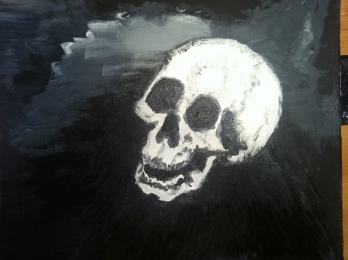 My plan is to have a cigar in the mouth with the smoke rising up on the left. I really can't decide if I will detail this or just keep it this sloppy raw look, we will have to see. I assume this style will appeal more to my personal tastes than most of yours. Any comments so far? By the way, Mike (muhren) is a great painter and a truly generous BOTL. We have been talking in PM's and he has been very helpfull! I highly recomend supporting him and his art! I really appreciate all your help Mike!
__________________
SUPPORT OUR TROOPS |
|
|
|
|
09-20-2011, 08:31 AM
|
#18 | |
|
EMPEROR TOMPKINS
|
Quote:
__________________
|
|
|
|
|
|
09-20-2011, 09:11 AM
|
#19 |
|
Dear Lord, Thank You.


|
I think the pencil sketch is awesome. While the painting is meritous technically, I don't like the subject matter, so it doesn't make me really "look at it", ya know? I had to go back and take a good look (twice) before I was ready to comment, just to be fair, and say it's really pretty awesome. How anyone can make paint do anything is beyond me, and the skull is really very complicated and intricate.
Well done, my man. I think you're going to really make this thing go in a big way.
__________________

|
|
|
|


 Linear Mode

